

Branding · Print · 2016
Mother Brown's Remedy
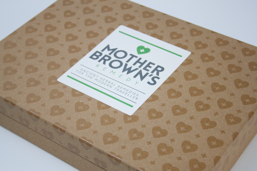
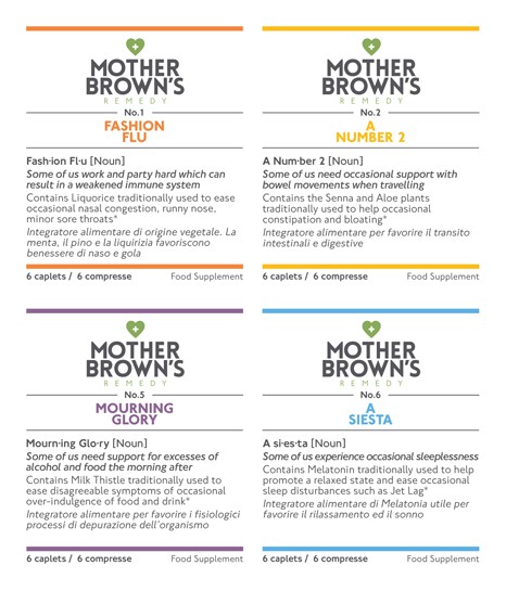
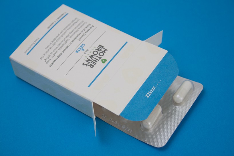
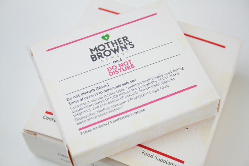
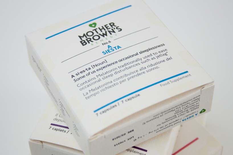
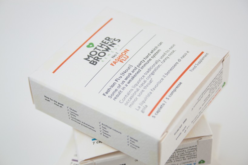
The Right Side were approached by Mother Brown's Remedy to develop the branding and packaging for this new natural and wholesome product. The world’s first functional food supplement kit for the modern traveller.
- Client
- Mother Brown's Remedy
- Disciplines
- Branding, Print
- Year
- 2016

01 / 17
The project
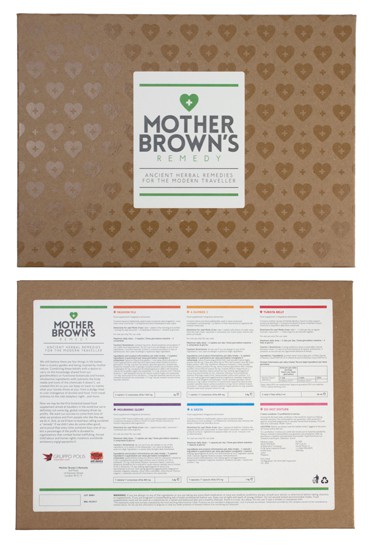
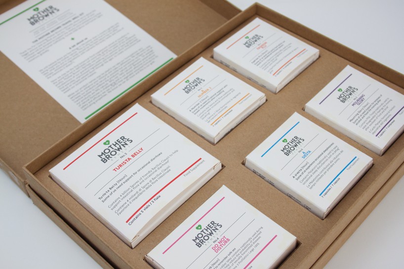
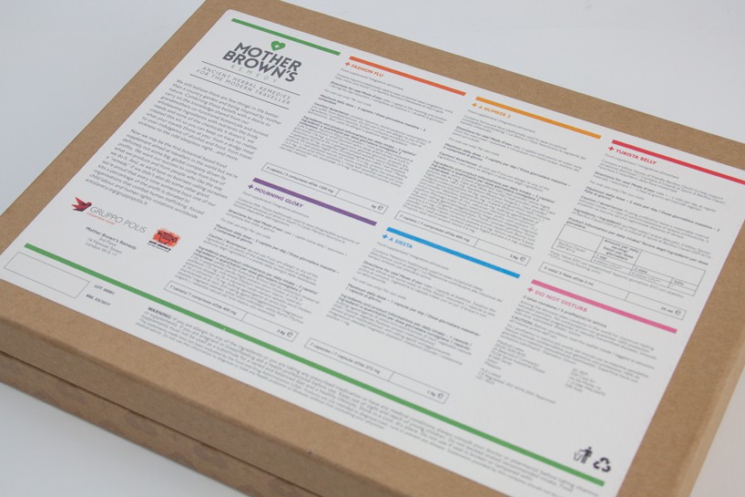
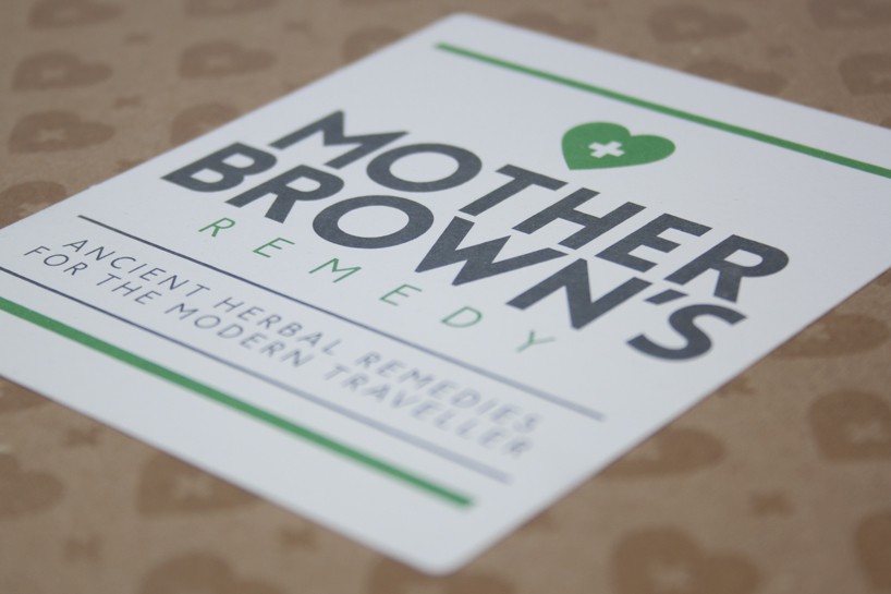
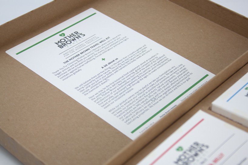
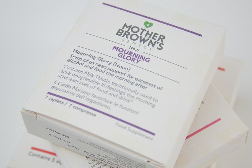
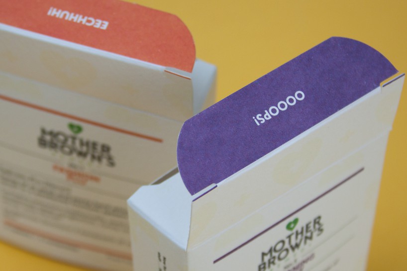
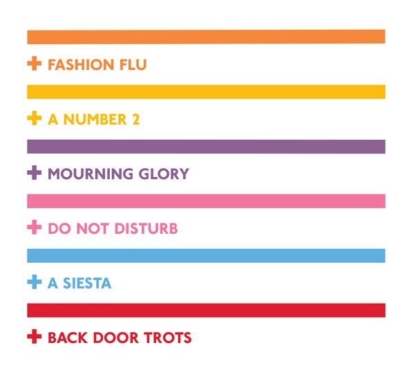
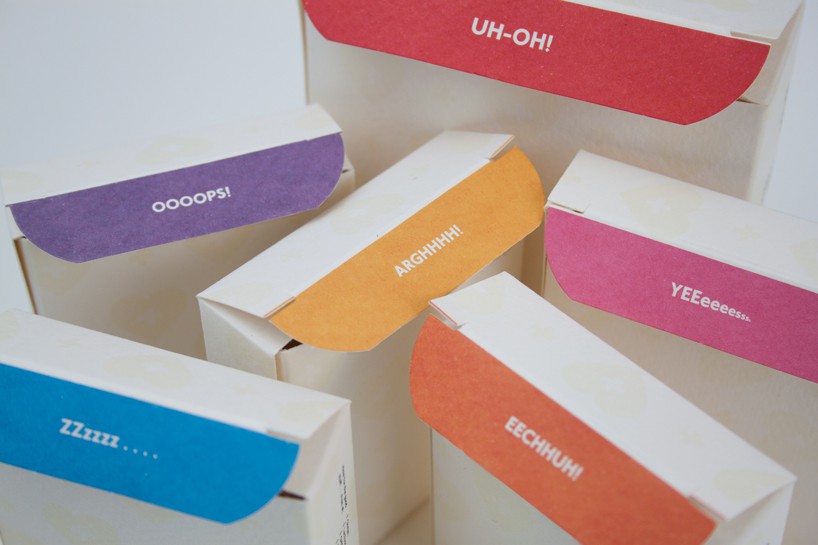
From conception to production, we developed a brand style that would reflect the simple and ethical philosophy of Mother Brown's Remedy. It needed to feel homely, yet luxurious, purposeful, yet quirky. The trees used to make the FSC approved recycled boxes come from forests that are certified, constantly managed and consistently replanted. The natural cardboard of the outer box was offset by the bright, pop colours used on the individual products. A Spot UV finish subtly introduces the brands logo as a pattern across the outer packing, and stickers were used for all the key information. www.motherbrownsremedy.com
Recovered from The Right Side archive