

Branding · Online · 2014
UROK Rebrand
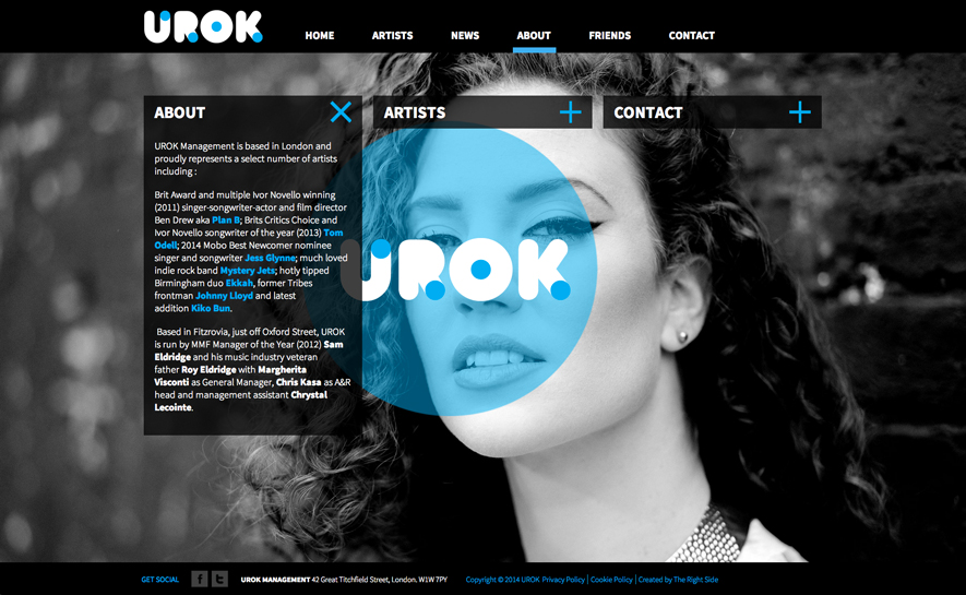
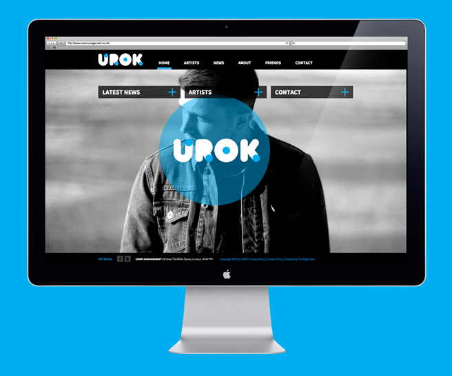
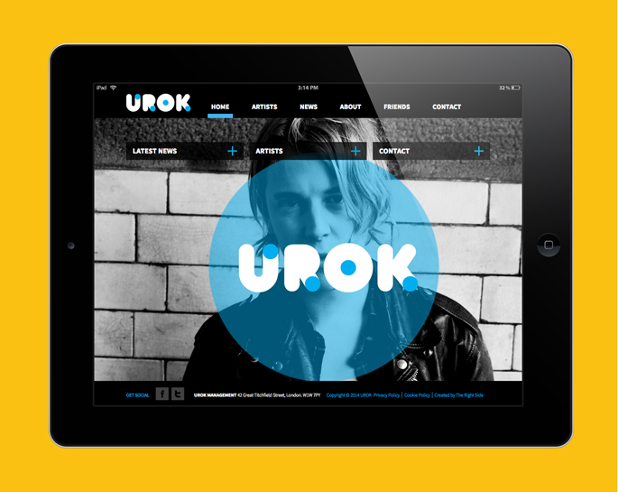
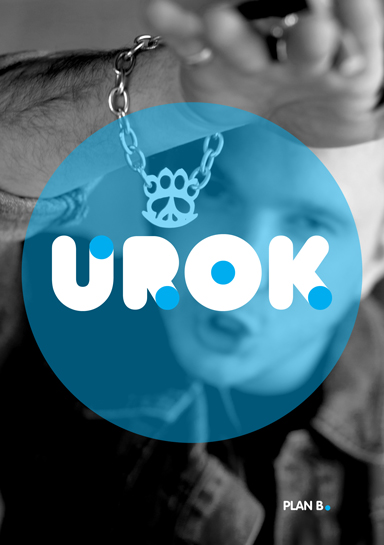
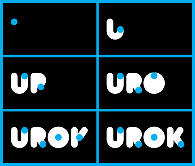
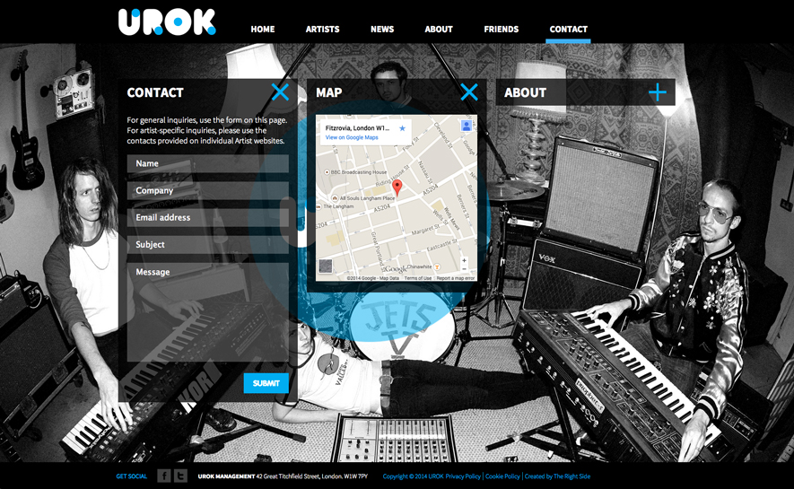
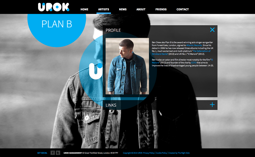
The Right Side were approached by music management company, UROK to refresh their brand and update their online presence. The branding draws upon the existing 'dot' element, which plays out across the logo and webiste, utilising circles as the defining shape.
- Client
- UROK Management
- Disciplines
- Branding, Online
- Year
- 2014
01 / 10
The project
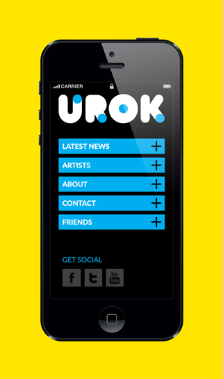
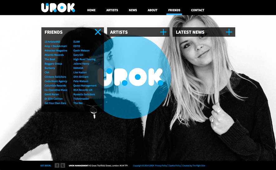
The webiste was designed with simplicity in mind. All the content is displayed within drop-down boxes, which can be assigned to any required page. The artists that Urok represent need to be clearly visible across the site. We designed the site to feature full-screen background images of the artists, which rotate in sequence. The images are presented in black and white to maintain continuity of colour across the site. We have worked with The Right Side on a number of projects previously and felt they were a great fit to look at the rebrand for UROK. As a music management company, it was important that we worked with a creative agency who not only understood our brand ethos, but also that of the artists we represent. We were especially pleased with the website design, as it played an important role in achieving the balance between UROK and the artists. Sam Eldridge www.urokmanagement.co.uk
Recovered from The Right Side archive